HELP
If you are designing your own project to be printed professionally, there are some things you should know. Although our prepress department will notify you if there are any problems with the files you submit, understanding and addressing these issues beforehand will ensure your project will go smoothly and speed up your turnaround. Take a moment to browse our help topics, you might learn something...
In the design world, there are two main ways to mix color, RGB and CMYK.
Their differences can sometimes make it difficult to get the colors in the final product to look the way we want.
RGB
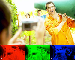
RGB is the mixing of red, green and blue points of light to produce colors on screens for computers and television. This is called an additive colorspace, which means that the more light on the screen, the brighter the image. When creating a design on the computer, all of the colors on the screen are produced by RGB.
CMYK
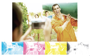
CMYK is the composite of tiny drops of pigments for four-color printing, and is the industry standard. Because of the nature of light and pigment, CMYK is a subtractive colorspace, which means that the more ink on the paper, the darker the image will be. Because of this, CMYK can't reproduce all of the same bright colors as RGB, so your files may look different from the screen once they are printed. If you compare the above images, you'll notice a difference in the vibrancy of the colors.
What to Do
When you turn in files to be printed, make sure that none of your images are RGB. You can do this in Photoshop through the image>mode menu. If you forget, we will take care of it, but be aware that color shift may occur. Quality proofs should be obtained to verify that colors are accurate.
Cyan, Magenta, Yellow and Black may be the standard inks used in the industry, but it is limited in the range of colors it can reproduce, and if your project calls for a specific color, you might need to use a spot color to get the color you want.
These colors can be used by themselves for single color or duotone jobs, or in addition to CMYK. With our large presses, we can print projects with up to 8 colors, so the only limit is your imagination. We can specially mix custom inks to match practically any color you wish to use, but we primarily work with Pantone® color guides.
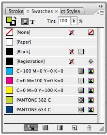
If you wish to use spot colors, they need to be mentioned in your estimate request, as they will change the total number of color plates, affecting the overall cost to run the job. They must also be specified in your working file as spot colors, or they will print using CMYK. In the example to the right, using Adobe In-Design, the spot colors Pantone 382 C and 654C are specified. Adobe products have digital swatchbooks built in, so you can select your spot colors easily, but keep in mind the kind of paper your project will use, as there are different swatchbooks for coated and uncoated stock, or special inks like metallics and flourescent colors. To clear up any confusion in prepress, double check to make sure your spot colors are identified properly, and delete all unused colors from your swatches palette.
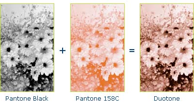
You can save money on your project by using just two spot colors. The main advantage of choosing duotone is that you only need two color plates, reducing the cost of printing. Also, by choosing the colors you use, you can match the colors you want exactly, such as Pantones or your company's signature color. The drawback is that your project will be limited to the colors that can be produced by mixing just two colors, so you will not be able to recreate full color images in duotone.
Duotone images are like CMYK images, but instead of using four pre-determined colors to reproduce your image, they use two colors of your choice. They are created by combining two grayscales of different colors, like the example below.
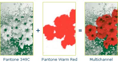
Multichannel images are an advanced form of duotone. They combine grayscale images and solid color channels to add a punch of color, like in this example:
Duotone images can create a variety of artistic effects, and add excitement or ambience to your project. So if your project has few or no images and just a couple specific colors, duotone might be for you.
Rich Black vs. Black
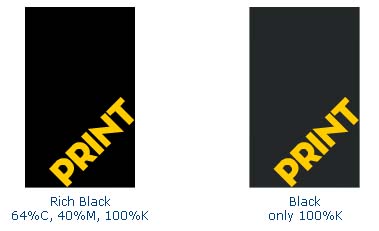
For CMYK Jobs, use Rich Black for large black areas, or they will appear dull. For all jobs, only use 100% black for text; use of rich black for text will cause registration problems.
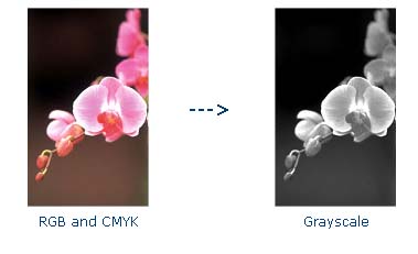
For single color jobs, using either grayscale or a Pantone spot color, convert your images to grayscale first.
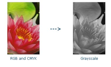
Please note that Red and Green have similar grayscale value, so your images may need to be edited to increase contrast after they've been converted to grayscale.
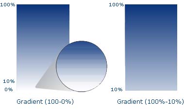
Gradients below 10% will create a banding effect: visible rows of lines making your gradient appear rough and blocky. Gradients must be greater than 10% to appear smooth.
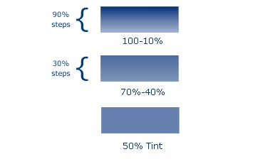
Many steps in a small area will also cause banding, so for small areas, further reduce the number of steps, or consider using a single tint instead of a gradient.
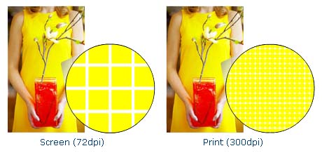
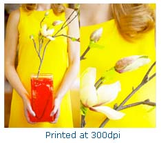
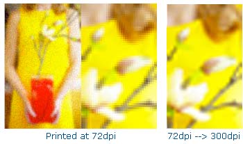
Image resolution is the amount of pixels per inch/dots per inch(ppi or dpi). Images displayed on computer monitors and saved for the web are 72 dpi, and printed products have 300dpi.
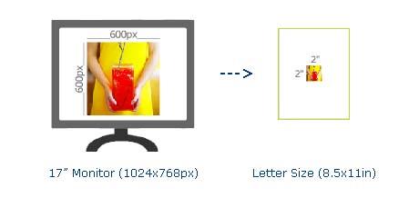
When an image's resolution gets changed, its size will change. An image that is 600x600 pixels at 72dpi will print only 2"x2" at 300dpi.
Whether you're printing CMYK or Grayscale, always save your images at 266 to Printing low-res images is bad!300dpi or higher for printing purposes, and 600 dpi or more for lineart. If not, the fuzziness and poor quality of your images will detract from your final product.
The only exception to this rule is if a 72dpi image gets reduced 40% or smaller in the application file. Sizing down an images increases resolution and improves print quality, making the low quality of the image less noticeable. On the other hand, if you increase the size of a low-quality image, it will look even worse in the final print.
Windows Metafiles (.wmf) and graphics captured from the internet (.gifs or .jpgs) are discouraged due to their low resolution. Each graphic imported into an application file, including Illustrator files, must be linked or embedded within the file, or the graphics will bitmap or not display at all.
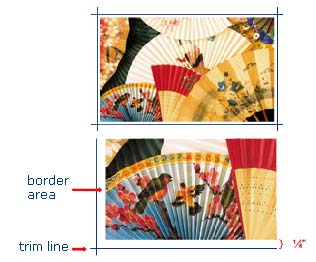
Borders
Borders are the white space surrounding an image. In order to maintain a symmetrical appearance, allow at least a 1/4" border between an image and the trim line.
Bleeds
Bleeds are the extra printed image that extends beyond the trim edge. If you have an image or a color field you want to run all the way to the edge of the page, you'll need to do a bleed.
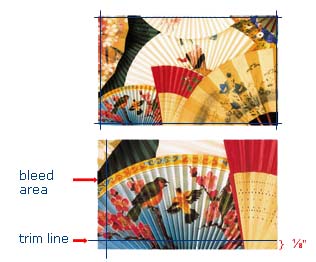
The page size in your layout application should be the trim size. If the document contains bleeds, make sure the bleed is at least 1/8" (0.125") off the page all the way around.
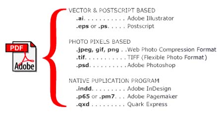
Extensions are helpful when going cross-platform between Macintosh and Window computers. Even though Macs do not require character extensions behind file names to be recognized, Windows machines use them. Corruption can occur when files sent via Email and FTP have not been compressed with Stuffit Deluxe or WinZIP. When assigning character extensions, the extension can denote what software the file originated from, whether it is a graphic or a page layout file, etc. Some of the extensions for the most popular software include .indd (Adobe In-Design), .psd (Photoshop), and .ai (Illustrator).
Characters such as \ / : * ? % # < > or extra periods in file names can cause problems when going cross-platform. For example, CPS.AD.3.375x7.875".Jan.02/ecm*.indd would not be seen on a Windows computer. Please avoid their use.
PDF (Portable Document Format) is the main ready-to-print format, and can be exported from a number of programs.
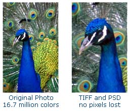
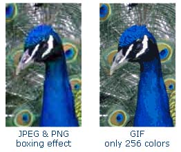
Always save photos as TIFF or PSD to maintain the highest quality without losing any pixels. Formats such as JPEG, GIF or PNG will lose quality each time it is resaved, and they will make your printed images look bad.
Below is a list of the font standards that Commerce Printing supports.
![]() TrueType Fonts (.ttf)
Standard for all digital type fonts
Each operating system uses an independant extension
PC & Mac users: provide all used .ttf fonts when sending to print
TrueType Fonts (.ttf)
Standard for all digital type fonts
Each operating system uses an independant extension
PC & Mac users: provide all used .ttf fonts when sending to print
![]() Postscript Fonts (.pfm + .pfb)
Worldwide standard for digital type fonts
Consists of a screen font (.pfm) and a printed font (.pfb)
PC Users need to provide both the parts of the font for printing
Mac users should send both the suitcase and the individual fonts
Postscript Fonts (.pfm + .pfb)
Worldwide standard for digital type fonts
Consists of a screen font (.pfm) and a printed font (.pfb)
PC Users need to provide both the parts of the font for printing
Mac users should send both the suitcase and the individual fonts
![]() OpenType Fonts (.otf)
A cross-platform font file format (Mac & PC)
All-in-one package, contains both TrueType and PostScript fonts
PC Users need to provide both the parts of the font for printing
Include the entire font family when submitting the file for print
OpenType Fonts (.otf)
A cross-platform font file format (Mac & PC)
All-in-one package, contains both TrueType and PostScript fonts
PC Users need to provide both the parts of the font for printing
Include the entire font family when submitting the file for print
![]() Multiple Master Fonts (MM)
Use only for creating a special effect such as LogoType
Fully customize weight, width, style and optical size
Do not use for body copy because of composition problems
Multiple Master Fonts (MM)
Use only for creating a special effect such as LogoType
Fully customize weight, width, style and optical size
Do not use for body copy because of composition problems
Font Styles
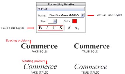
Only use font styles that are included in the font family. Do NOT use fake font styles by clicking on the "bold" or "italic" options. These fake styles either fatten or slant the letters, but do not properly space or style the letters, and create composition problems.
- COLOR: Make sure to convert all RGB to CMYK or to grayscale
- RESOLUTION (DPI): All photos should be 300dpi
- RESOLUTION (LPI): All line art should be 600lpi
- FORMAT: Be sure to save images as high resolution formats
- BLEED: Reserve at least 1/8" beyond the actual trim size
- HAIRLINE RULES: All thin lines should be at least .25 point thick
- RICH BLACKS: Large black areas in rich black (60%C, 40%M, 100%K)
- GRADIENTS: Use a photoshop gradient instead of a vector gradient
- LINKED GRAPHICS: Include all linked graphics that are used in the file
- FONTS: Provide all fonts (TrueType and PostScript). Avoid font styles
- PROOF: Include a laser mockup of your final file for output